
A single cobalt line on a white ground. No gilding. No relief. No narrative excess. The restraint of cheonghua baekja is not minimalism in the Western sense — it is a resolved argument about what ceramic surfaces are for.
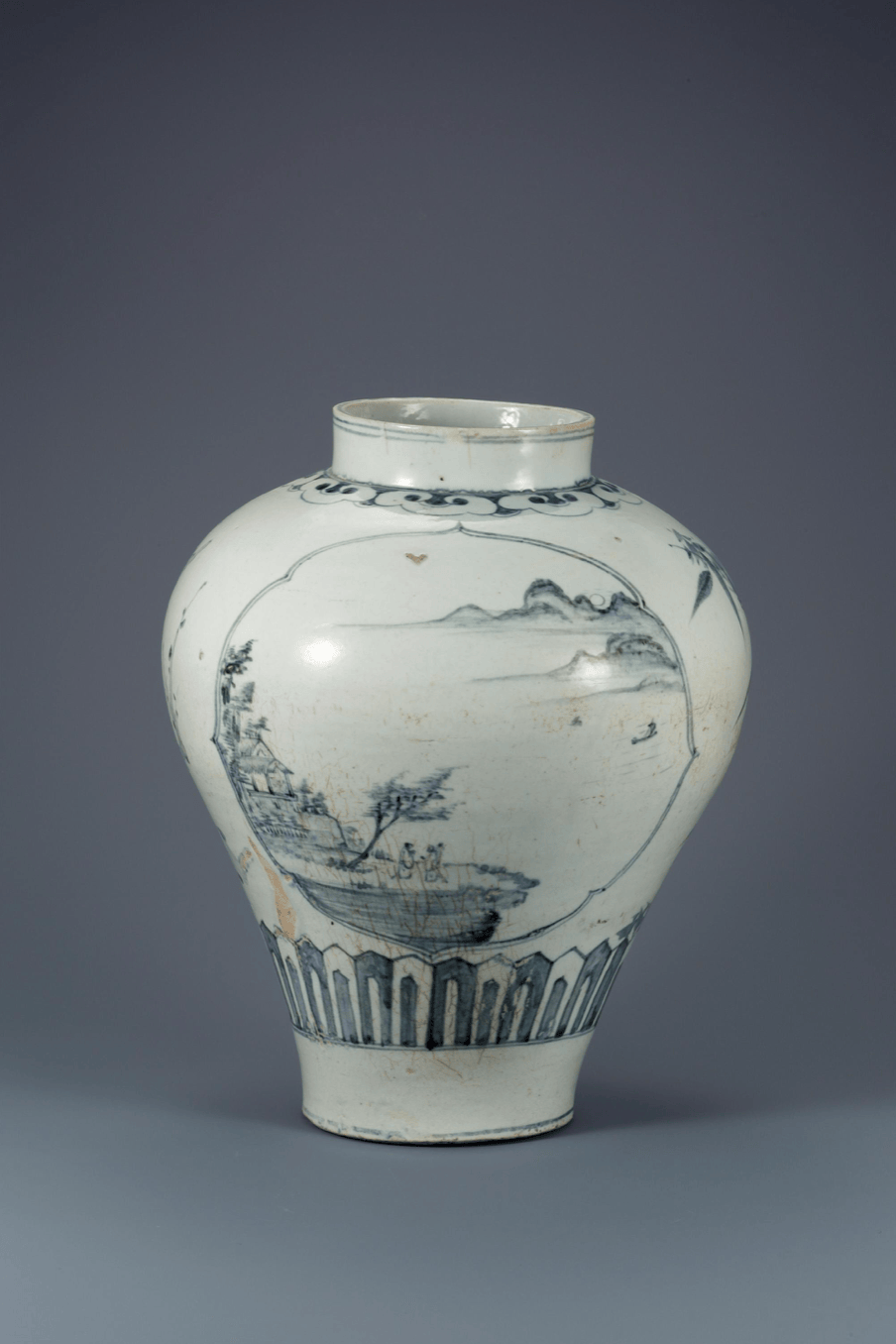

Cheonghua baekja — Korean blue-and-white porcelain — reached its formal peak during the Joseon dynasty (1392–1897), a period defined not by decorative abundance but by deliberate constraint. The word itself describes the technique: cheonghua (청화, 靑華) refers to the blue-pigment painting applied to the unfired surface; baekja (백자, 白磁) denotes the white porcelain body beneath. The combination is, in the strictest material sense, a problem of contrast management — how much of the white ground to preserve, and how the blue line moves across it.
That question of proportion was not left to individual potters. The royal court’s ceramic administration, operating through the Bunwon kilns near Seoul, established production norms that shaped the visual language of the entire tradition. The result is a body of work that reads, across centuries, as surprisingly coherent — not because individual pieces are identical, but because they share an underlying logic about where decoration belongs and where silence is the better choice.
For designers working in CMF (colour, material, finish), this is the useful entry point. Cheonghua baekja is not a historical curiosity. It is a documented system for managing the relationship between a dominant surface and a secondary graphic element — a problem that recurs in every product that uses print, pattern, or texture against a base material.
Cobalt in Korea — the pigment’s arrival and adaptation
Cobalt oxide arrived in Korea via trade routes from Persia and China, where it had been used in ceramic decoration since the Tang dynasty. In Joseon Korea, the pigment was called hoehoecheong (회회청, 回回靑) — a term that encodes its foreign origin directly. Early Joseon pieces from the fifteenth and sixteenth centuries often show irregular pigment behaviour: bleeding at the edges, uneven intensity, the visible record of a material not yet fully understood in the local firing environment.
That technical uncertainty produced something visually interesting. The slightly blurred cobalt line against white porcelain — a byproduct of imperfect pigment control — became a defining characteristic that later potters worked with rather than against. By the seventeenth century, Korean ceramic workshops had developed a handling of cobalt that differed from the Chinese prototype: less intense saturation, more variation in stroke weight, a willingness to leave areas of blue incomplete. This was not technical failure. The Bunwon kilns were capable of producing denser, more uniform pigment application. The looser quality was a choice about surface character.
Firing behaviour: Cobalt oxide is applied to the unfired clay body (underglaze), then covered with a transparent celadon-influenced glaze before firing at approximately 1,250–1,300°C. At that temperature, the cobalt migrates slightly into the glaze layer, creating the soft edge characteristic of authentic Joseon pieces. This migration is controlled but not eliminated — it is part of the intended surface quality.
Contemporary relevance: The specific blue of cheonghua baekja — a cool, slightly grey-inflected cobalt rather than the warmer, more saturated blues of Chinese or Dutch prototypes — has influenced Korean industrial colour palettes. KIA’s CMF team has referenced historical Korean ceramic tones in its interior colour studies; the 2024 EV9 interior introduced a muted blue-grey that traces a direct line to this tradition.
White as the active material — baekja surface logic
European discussions of blue-and-white ceramics tend to treat the white ground as neutral — a support surface that exists to make the blue visible. In Joseon ceramic theory, the relationship is reversed. Baekja — pure white porcelain — was the prestigious object. The white body was refined from specific clay deposits in Gwangju, Gyeonggi province, chosen for their iron-low composition, which produced a surface close to pure white after high-temperature firing. This white was the achievement. The cobalt decoration was applied to it, not the other way around.
The practical consequence is visible in the placement logic of Joseon cheonghua baekja. Decorative motifs — dragons, plum blossoms, bamboo, auspicious characters — occupy specific zones of the vessel: the shoulder, the belly band, the neck. Large areas of the white body are left bare. A typical Joseon urn might have seventy to eighty percent of its surface undecorated. In European Delftware of the same period, the pattern density is often reversed, with cobalt ground covering most of the surface and white reserved for highlights. The underlying assumption about which material carries value is structurally opposite.
Joseon potters were not using white as an absence. They were using it as a material with its own argument — one that cobalt decoration was meant to support, not dominate.
This distinction matters for anyone thinking about surface design. The question of how much of a base material to cover — in ceramics, in packaging, in textile pattern — is always a question about the base material’s own presence. In the Joseon approach, covering the white ground too densely would have been a failure of judgement about the clay itself, not merely a stylistic excess.
Cheonghua baekja and Korean CMF logic — from Joseon to contemporary design
The influence of cheonghua baekja on contemporary Korean design is most legible in the category of CMF — the colour, material, and finish decisions that define how an object reads before a user engages with its function. Korean industrial design education takes material history seriously in ways that are not universal in European programmes. The National Museum of Korea’s ceramic collection is a curriculum reference, not an archive curiosity.
The specific characteristics of Joseon blue-and-white — restrained decoration density, a cool cobalt that reads as considered rather than decorative, the elevated status of an unfinished-looking white surface — recur across categories of contemporary Korean product design. The preference for matte, near-white surfaces in Korean consumer electronics; the use of single-line graphic motifs on otherwise plain packaging; the willingness to leave structural material visible rather than covering it with finish — these are not direct quotations from cheonghua baekja, but they share an underlying assumption about the hierarchy between surface and decoration.
White clay body is the primary material of value. Decoration occupies a defined secondary role and does not compete with the base surface.
Cobalt pigment is used sparingly. Empty surface reads as resolved, not unfinished. Density of decoration signals restraint, not poverty of means.
Motif placement is structural — shoulder, belly band, neck — rather than field-fill. The undecorated surface has positive presence.
Tin-glazed earthenware uses cobalt to compensate for a less refined base body. The white tin glaze is a coating, not the clay itself — decoration covers it extensively.
Higher decoration density reads as higher value. Pattern coverage signals craft investment and complexity.
Field-fill patterns are common. The decorated surface is the object; the ground beneath has no independent presence.
The restraint problem — what cheonghua baekja refuses to do
There is a recurring misreading of Joseon ceramic restraint as proto-minimalism — a Korean anticipation of twentieth-century reduction aesthetics. This reading is convenient but incorrect. The Joseon court’s decorative norms were not about removing excess; they were about correct proportion. Dragon motifs on royal vessels were highly specific in their composition and placement because symbolic accuracy mattered, not because less was philosophically preferable to more.
The restraint of cheonghua baekja operates within a system of meaning, not outside it. A Joseon moon jar (달항아리, dal-hangari) — a spherical white vessel with minimal or no decoration — is not minimalist in the Bauhaus sense. It is the expression of a specific material value: the purity of the white clay body as the point of the object. The absence of cobalt decoration on a moon jar is not emptiness; it is the statement that nothing needs to be added to the white. That is a different argument from “less is more.”
Contemporary Korean designers who draw on this tradition are navigating the same distinction. The challenge is not to apply less decoration. It is to have a clear argument about what the base material is worth — and to design decoration that supports that argument rather than overriding it.
Working in product development across Seoul and London, I spent considerable time reviewing ceramic reference materials for packaging design projects that needed to position themselves within a Korean design heritage without resorting to superficial motif quotation. The problem with cheonghua baekja as a reference is that its most powerful quality — the weight of the white — cannot be borrowed by applying a blue line to a white box. The logic of the original is about the material relationship between a high-temperature clay body and an underglaze pigment. That relationship has no equivalent in paper or polymer. What can be borrowed is the decision structure: which surface carries value, and what role does graphic decoration play relative to it.
In Berlin, working with European designers on Korean-origin briefs, I notice that the most common failure is treating white as neutral. European design practice tends to treat white packaging as a canvas — a starting condition to be worked on. The Joseon reading of white as the finished state — the valuable material — is genuinely foreign to most European designers I’ve worked with, and explaining it by reference to cheonghua baekja is usually more productive than any abstract description of Korean design philosophy.
References
- National Museum of Korea — Ceramic Art Collection. museum.go.kr
- Korea Craft & Design Foundation (KCDF). kcdf.kr
- Korea Institute of Design Promotion — DesignDB. designdb.com
- KIA Design Magazine — CMF Trend Studies. kiadesignmagazine.kia.com
- Kim, Jae-yeol. Joseon Baekja — The Aesthetics of White. National Museum of Korea Publishing, 2018.
- Gompertz, G.S.G.M. Korean Celadon and Other Wares of the Koryŏ Period. Faber & Faber, 1963.




Leave a Reply