
The easiest misreading of Lie Sang-bong’s Hangul collections is that they are print design applied to clothing. They are not. They are a CMF decision — a choice about what Korean script looks like when its constituent geometry is treated as a surface pattern system rather than as a carrier of linguistic meaning.
Lie Sang-bong (이상봉, born 1956) is one of the few Korean designers with a sustained international profile that predates the K-fashion wave of the 2010s. He began showing at Paris Fashion Week in 2007, and the collection that produced his international recognition used Hangul — the Korean alphabetic script devised by King Sejong in the fifteenth century — as its primary surface material. Not as a slogan or a cultural reference, but as a structural element of the garment’s visual surface.
The decision is easier to understand if you start from Hangul’s graphic properties rather than from its linguistic ones. Hangul is a featural alphabet: its letters were deliberately designed to reflect the phonological properties of the sounds they represent, and its construction — combining consonant and vowel elements into syllabic blocks — produces a visual language that is simultaneously modular, geometric, and infinitely reconfigurable. A Hangul syllable block is a square-bounded composition of two to four elements. Repeated across a textile surface, these blocks generate a grid-based pattern that behaves, visually, like a textile repeat — a design element rather than a text.
This graphic quality is not an accident of Hangul’s history. King Sejong’s 1443 design specification for the script explicitly referenced geometric principles: the circular, triangular, and linear forms of the original consonant letters were derived from the shapes of the articulatory organs that produce them — tongue, lips, throat. The script was designed with a visual logic built in. Lie Sang-bong is not imposing a graphic sensibility onto Hangul; he is drawing out a graphic potential that was always there.
Hangul as geometric system — the structural argument
The standard analysis of Hangul’s superiority as a writing system focuses on its phonological precision — each grapheme corresponds to a specific articulatory feature, making the script highly regular and learnable. This is correct, but it misses the visual argument. Hangul’s syllabic block structure produces a visual field that is fundamentally different from both alphabetic scripts (where letters follow in a horizontal sequence with variable rhythm) and logographic scripts (where each unit carries semantic weight that varies in visual complexity).
A Hangul syllabic block is a fixed-format unit — always bounded within a notional square, always composed of a defined number of elements in defined positions. The ㅂ + ㅏ + ㄱ combination that produces the syllable “박” occupies the same visual square as ㄴ + ㅜ + ㄴ for “눈.” Every syllable is the same size. The visual field generated by a Hangul text is therefore a grid of equal-sized units with internal variation — which is exactly the structure of a textile repeat pattern. This is why Hangul works as a surface material in a way that Latin typography does not: Latin letters vary in width (i is not as wide as m), sit on a baseline rather than within a square, and create an uneven visual rhythm that textile repetition makes visible as irregularity.
Element geometry: The nineteen basic consonants and twenty-one vowels of Hangul are composed from three primitive forms: a horizontal line (representing the flat tongue), a vertical line (representing upright posture), and a circle (representing heaven or the rounded mouth). Their combinations are geometric rather than calligraphic — they are designed, not evolved. This means the script’s graphic character is consistent and predictable across all uses.
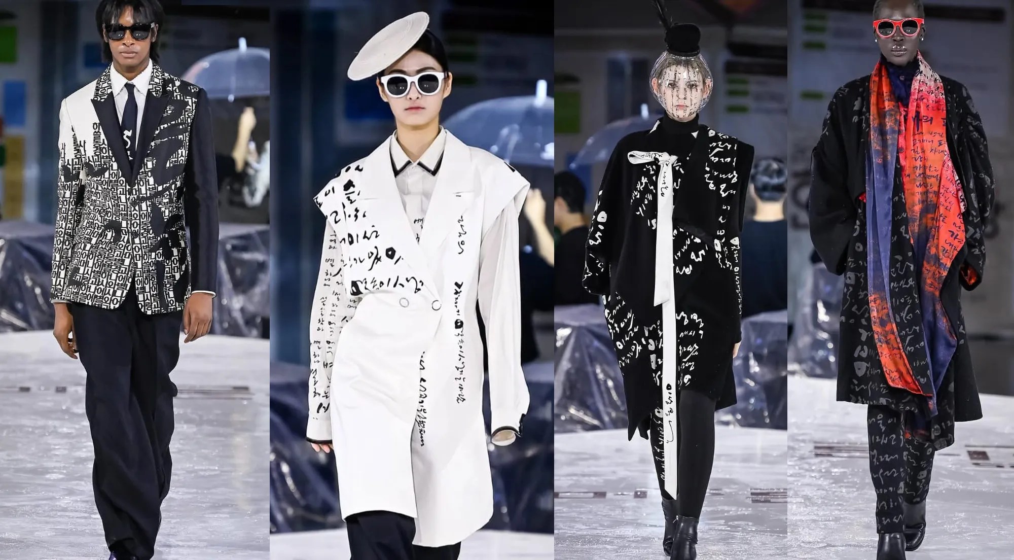
CMF implication: On textile, Hangul blocks printed at scale behave as geometric pattern rather than linguistic content. The reader who does not read Korean sees a modular grid with internal variation. The reader who reads Korean sees both: the pattern and its semantic layer simultaneously. This double reading is not available with Latin-text fashion design, which produces either illegible decoration or legible message but rarely both simultaneously.
The CMF decision — script as surface, not signage
The critical CMF decision in Lie Sang-bong’s Hangul work is scale. At the scale of a word or phrase on a T-shirt — the scale at which most fashion typography operates — Hangul reads primarily as language. The viewer’s first response is to read, and if they cannot read Korean, the text functions as decoration with an exotic character. This is the mode that almost all Korean-language fashion text operates in outside Korea.
Lie Sang-bong’s collections use Hangul at a different scale — often filling entire garment panels with syllabic blocks at sizes ranging from two to fifteen centimetres. At this scale, the linguistic reading is disrupted: the viewer’s visual system resolves the blocks as pattern before it resolves them as text. The semantic content is still there (the 2007 Paris collection used verses from Korean poetry, making the content recoverable for Korean-literate viewers), but it is embedded in a visual structure that does not require semantic access for its formal effect.
The typography does not decorate the garment. The garment is the typography — a surface constructed from the visual logic of a script, not a surface onto which a script has been printed.
The colour decisions in these collections reinforce this reading. Lie Sang-bong’s Hangul works are frequently rendered in tonal ranges — dark ink on lighter ground, or gold on white — that suppress the contrast between script and substrate rather than maximising it. High-contrast text reads as signage; low-contrast text at large scale reads as texture. The CMF combination of Hangul block geometry at surface scale with deliberately subdued colour contrast is the mechanism by which the script crosses from information into material.
Hangul CMF vs European typographic fashion
Script geometry is used at surface scale — blocks large enough to resolve as pattern before resolving as text. The semantic content is present but not primary; the formal structure of the script is the design element.
The square-bounded syllabic block produces a consistent grid-module regardless of content. Any text produces the same visual field density. The pattern is script-derived but content-independent in its visual rhythm.
Colour treatment suppresses legibility to activate texture. The script functions as a surface material with latent semantic content — recoverable, but not foregrounded.
Typography on European fashion typically operates at phrase or slogan scale — readable from a distance, with semantic content as the primary design element. The text’s meaning is the design’s meaning.
Latin typography’s variable letter width and baseline structure produces uneven visual rhythm at textile scale, making it unsuitable for seamless surface-fill pattern without deliberate distortion or regularisation.
High contrast between text and ground maximises legibility. Typography functions as graphic communication on a garment surface, not as the surface itself.
Lie Sang-bong’s position in Korean fashion history
Lie Sang-bong occupies an unusual position in Korean fashion: he is simultaneously a historical figure (his Paris debut predates K-fashion’s international moment by nearly a decade) and an active practitioner. His Hangul work has influenced a generation of Korean designers who now approach the script as a design resource, though most have moved toward different formal strategies — using Hangul’s geometric primitives (the consonant forms in isolation, the vowel line structures) rather than the full syllabic block system.
The international reception of his Hangul collections has also evolved. The 2007 Paris debut was read primarily as cultural statement — a Korean designer asserting Korean cultural identity on a global stage. By 2015, the critical language had shifted toward formal analysis: reviews in international fashion media began discussing the Hangul work in CMF terms, noting the pattern-system logic rather than treating it as cultural performance. This shift reflects both changes in the critical context (increased sophistication about Korean design culture in European fashion media) and changes in how the work is framed by the designer and his communications team.
My work in accessory design brought me into direct contact with the question that Lie Sang-bong’s practice raises — how do you use Korean material culture as a design resource without producing heritage costume or tourist-grade Orientalism? The Hangul work is one of the clearest answers to that question that Korean fashion has produced. It works not because it asserts Korean identity but because it makes a formal argument about what Hangul looks like as a surface system. The assertion is a consequence of the formal decision, not the other way around.
In Berlin, I have used the Lie Sang-bong Hangul collections as a reference in design briefings with European clients who need to understand how Korean cultural material can be used formally — as a source of geometric logic — without becoming quotation or pastiche. The reaction is consistent: European designers who are shown the work through a CMF lens (what is the module? what is the grid? how does scale function?) engage with it very differently from those who are shown it through a cultural lens (here is a Korean designer using Korean script). The former produces design conversation; the latter produces appreciation followed by uncertainty about how to proceed. The CMF reading is more practically useful.
The limit of the Lie Sang-bong approach, and one he has acknowledged, is its dependence on Hangul’s specific geometric properties. The formal argument he is making is script-specific — it works for Hangul precisely because of the syllabic block’s square-bounded module structure. It cannot be directly translated to other writing systems without the same conditions applying. This is simultaneously the work’s strongest quality (it is genuinely rooted in the specific properties of its source material) and its most significant constraint (it does not generalise to a design method that others can simply adopt).
References
- Seoul Fashion Week Official — designer archive and collection documentation. seoulfashionweek.org
- National Hangeul Museum (국립한글박물관) — Hangul history and design documentation. hangeul.go.kr
- Korea Institute of Design Promotion — DesignDB, Korean fashion and design analysis. designdb.com
- Korea Craft & Design Foundation (KCDF). kcdf.kr
- Sampson, Geoffrey. Writing Systems: A Linguistic Introduction. Stanford University Press, 1985. (On Hangul’s featural architecture.)
- Kim, Jungman. “Lie Sang-bong’s Hangul fashion: typography as cultural CMF.” Journal of the Korean Society of Costume, Vol. 64, No. 5, 2014.




Leave a Reply